An interactive 3D globe mapping 599 'carbon bombs' and 2,343 fossil-extraction sites — and the companies and banks behind them.
Loads the 3D carbon engine
About this map
Carbon Bombs
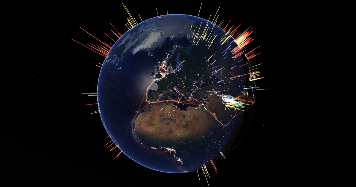
Every glowing spike is a carbon bomb — a single coal, oil, or gas project so large that, if its reserves are fully dug up and burned, it alone would release more than one billion tonnes of CO₂. The small pale points are the next tier down: thousands of newer fossil-extraction sites approved since 2021. Together they map where the fossil-fuel era is still being expanded — and how much carbon that locks in.
Reading the globe
- Spikes — carbon bombs. Height grows with the project’s CO₂ (on a square-root scale, so the largest don’t flatten the rest). By default, colour follows height on a heat ramp — yellow through orange to red and magenta — so the taller the spike, the hotter it burns. Other colourings (the original 2022 list, carbon budget, fuel, status, region…) live under Display → Color.
- Pale grey dots — smaller “new extraction” projects, below the 1-gigatonne bomb threshold but still adding to the pile.
- Orange-gold glow over the oceans — satellite-mapped industrial activity at sea around offshore oil infrastructure. The brightest patches are the world’s busiest offshore basins. Toggle and tune it under Display → Raster layers.
- Click any spike to open its dossier: emissions, the companies extracting it, and the banks financing them.
What is a “carbon bomb”?
The term comes from a 2022 study in Energy Policy by Kühne and colleagues. They set a deliberately simple line: any extraction project whose remaining reserves, once burned, would emit more than 1 gigatonne (Gt) of CO₂ over its lifetime. One gigatonne is a billion tonnes — roughly a year of Japan’s fossil-fuel emissions, or almost two of Germany’s, from one mine or field. The original study found 425 of them; the live database this map draws on has grown the count to about 600, plus ~2,340 smaller new projects.
Why it matters: the carbon budget
Physics gives us a carbon budget — a finite amount of CO₂ humanity can still emit before warming blows past 1.5 °C, the safer Paris Agreement limit. That budget is small and shrinking every year we keep emitting: recent estimates span roughly 80 to 210 Gt of CO₂ left, depending on the method and the odds you accept. The carbon clock on this map ticks on 130 Gt — the Indicators of Global Climate Change 2025 estimate (Table 8, even odds), counted from January 2026.
The carbon bombs alone hold on the order of 1,200 gigatonnes of potential CO₂ — several times over what the entire planet can still afford to emit. By the tightest budgets, the bombs represent more than ten times the room we have left. The fuels are already in company plans and on the books. The map is, in effect, a picture of carbon we have promised to release but cannot afford to.
The most hopeful number on this map
Just over a third of these carbon bombs — 208 of 599 — have not started extracting yet. They have no sunk infrastructure, no jobs to protect, no stranded investments — nothing yet to unwind. That makes not lighting them in the first place the cheapest, fastest, least painful climate action available. Cancelling just the not-yet-started projects would keep 389 gigatonnes of CO₂ in the ground — almost a third of all this potential carbon. The danger on this map is large, but a big share of it is still optional.
Follow the money
Mega-projects don’t happen without financing. Linking each project to the companies that operate it, and those companies to their lenders, reveals that the world’s 65 biggest banks channelled about US$1.6 trillion to the firms behind these projects between 2021 and 2024 (Banking on Climate Chaos). Finance is therefore one of the clearest levers: without the money, many of these projects would never be built. (Click a spike to see its operators and their financiers.)
Industrial activity at sea
The glowing ocean layer is a different kind of evidence. Where the spikes and dots map fossil reserves — carbon still in the ground — this layer shows the fossil economy in operation: a year of vessel traffic (2021) servicing offshore oil platforms, rigs, and support fleets, detected from space. Researchers combined satellite radar and optical imagery with vessel-position signals and machine learning to map industrial activity across the global ocean — much of it previously invisible to public tracking. The result is the clearest picture yet of the operating footprint of offshore oil: the bright clusters over the North Sea, the Persian Gulf, the Gulf of Mexico, West Africa and offshore Brazil are exactly the basins where carbon bombs are being actively worked. Brightness is vessel-hours per square kilometre on a logarithmic scale (roughly 0.01 to 100); empty ocean stays dark.
A few key terms
- Carbon budget
- The total CO₂ we can still emit and stay within a temperature limit. For 1.5 °C, only a small, shrinking amount remains.
- Potential (lifetime) emissions
- The CO₂ a project would release if all its remaining reserves were extracted and burned — a maximum, not a prediction.
- Committed / locked-in emissions
- The future CO₂ effectively promised the moment a mine or field is built. Existing fossil infrastructure already commits more than the 1.5 °C budget — which is why scientists say no new extraction fits the math.
- Stranded assets
- Fossil investments that lose their value when the world acts on climate — mines and fields forced to close before they pay off. Cancelling new bombs avoids creating them.
- Supply-side climate action
- Cutting emissions by limiting how much fossil fuel is extracted, alongside the familiar demand-side work (efficiency, renewables, electric transport).
- Production gap
- The mismatch between the fossil fuels governments plan to produce and the far smaller amount the climate can absorb — planned production is roughly double what 1.5 °C allows.
What can actually be done
The power of the “carbon bomb” framing is that it turns an overwhelming, abstract crisis into a finite, nameable list of projects that can be defused — and a way to measure progress. The researchers’ priority order:
- No new bombs, first. A moratorium on not-yet-started projects is the cheapest win and creates no stranded assets. The UN Secretary-General has called for exactly this.
- Managed decline of existing ones (“harvest mode”): keep producing but make no new investment, so output naturally falls.
- Close the dirtiest first. Coal mostly makes electricity — where renewables are now the cheapest power on Earth — so coal bombs are first in line.
- Cut the money. End fossil-fuel subsidies (a standing G20 promise), redirect bank financing, divest.
- Cooperate internationally — including a proposed Fossil Fuel Non-Proliferation Treaty, modelled on nuclear arms control, and support for poorer producer countries.
How the data works — and its limits
Locations, reserves, and emissions come from the original Kühne et al. (2022) study and the open carbonbombs.org database, which draws on Global Energy Monitor, Rystad Energy, GOGEL/Urgewald, and Banking on Climate Chaos. Treat every figure as an order of magnitude, not an exact value: potential emissions assume all reserves are burned; the carbon budget is itself a moving, probabilistic number; some project coordinates (large shale plays, offshore blocks, basins) are approximate; and the company–bank links can only be a conservative lower bound. The picture is faithful in scale and shape, not in the last digit.
Full sourcing, data licences, and links are in the Sources & references tab above.
Every layer on this globe is built from open, published data. Here is what feeds it, where to find it, and the terms under which it is used.
Carbon bombs — the spikes & dots
- Kühne, K., Bartsch, N., Driskell Tate, R., Higson, J. & Habet, A. (2022). “Carbon Bombs” — Mapping key fossil fuel projects. Energy Policy 166, 112950. — the founding study and its 425-project list.
- carbonbombs.org — the live, maintained database this map draws on (~600 bombs + ~2,340 new projects). See its methodology. Built and published by Data for Good, Reclaim Finance, éclaircies and LINGO.
- Upstream sources compiled by carbonbombs.org: Global Energy Monitor, Rystad Energy, GOGEL / Urgewald, and Banking on Climate Chaos (operator → financier links).
Industrial activity at sea — the ocean glow
- Paolo, F. S., Kroodsma, D., Raynor, J. et al. (2024). Satellite mapping reveals extensive industrial activity at sea. Nature 625, 85–91.
- Density rasters & vessel-detection data: Global Fishing Watch — vessel activity around offshore oil infrastructure, 2021.
Climate & carbon-budget context
The carbon clock on this map counts down the remaining 1.5 °C budget. Its central figure (130 Gt CO₂ from January 2026, even odds, falling ~1,331 tonnes a second) is from the Indicators of Global Climate Change 2025; a higher independent estimate (170 Gt) comes from the Global Carbon Budget 2025. The clock’s uncertainty wedge spans the odds you accept — 80 Gt at 2-in-3 chances of holding 1.5 °C, up to 210 Gt at 1-in-3.
- Indicators of Global Climate Change 2025 — Forster et al. (2026), Earth System Science Data 18, 3889–3933. The clock’s 1.5/1.7/2 °C budgets (Table 8), the 80/130/210 Gt odds range, the ~1,331 t/s depletion rate, and the latest warming (1.37 °C in 2025, +0.27 °C/decade) and CO₂ (425.7 ppm) figures.
- Global Carbon Budget 2025 — Friedlingstein et al., Earth System Science Data (preprint); via the Global Carbon Project. The higher independent 170 Gt estimate shown in the clock’s “how sure are we?” range.
- Armstrong McKay et al. (2022) — climate tipping points: why crossing 1.5 °C raises the risk of ice-sheet, coral and permafrost tipping. Explore them in GLOBAÏA’s Tipping interactive.
- IPCC Sixth Assessment Report (AR6) — remaining-budget estimates and supply-side mitigation framing.
- Banking on Climate Chaos 2025 — the “follow the money” financing figures (~US$1.6 trillion, 65 banks, covering January 2021 – December 2024).
- UNEP Production Gap Report — the source for the “production gap”: governments plan to produce roughly double the fossil fuels in 2030 that 1.5 °C allows.
Base map & geography
- Earth imagery: NASA Visible Earth — Blue Marble (day) & Black Marble (night lights).
- Coastlines, boundaries & graticules: Natural Earth (public domain).
Licence & terms of use
The carbon-bombs dataset (spikes & dots) is published by Data for Good, Reclaim Finance, éclaircies and LINGO under Creative Commons Attribution–NonCommercial 4.0 (CC BY-NC 4.0); see the carbonbombs.org terms of use. This is a non-commercial visualization by GLOBAÏA, a non-profit organization — shared with attribution to the four partner organizations and clear licence indication, as the licence requires. Data for Good gives no warranty as to accuracy or completeness; treat every figure as an order of magnitude.
Suggested citation
GLOBAÏA (2026). Carbon Bombs [interactive visualization]. globaia.org/carbon/. Accessed .
A GLOBAÏA visualization · globaia.org