Our Name
The name GLOBAÏA is a combination of two words, “global” and “Gaïa”, which signifies the organisation’s commitment to fostering a deeper understanding and appreciation of our planet and its place in the cosmos
In ancient Greek cosmology, Gaïa (Γαῖα) was the primordial mother goddess — the Living Earth herself, from whom all life emerged. The word is ancient, possibly older than Greek itself: linguists believe it may predate the arrival of Indo-European speakers in the Aegean, making its origins one of the enduring mysteries of historical linguistics.
The bond between earth and humanity is woven into language at its oldest layers. The Proto-Indo-European root *dʰéǵʰōm (“earth”) gave rise to both Greek χθών (khthōn, “earth,” as in “chthonic”) and Latin homo (“human”) — literally “earthling,” a being of the soil rather than the sky. Whether through Gaïa or through this ancient root, the message is the same: we are of the Earth, not apart from it.
By incorporating “global” into the name, it underscores the contemporary understanding of Earth’s place in the universe, acknowledging that our planet orbits a star among hundreds of billions in the Milky Way, itself one galaxy among thousands in the Laniakea Supercluster. This fusion of ancient wisdom and modern awareness reflects GLOBAÏA’s mission to inspire a more sustainable and harmonious relationship between individuals, societies, and our planet.
Our Logo
![]()
The “O” in GLOBAÏA’s logo is designed as a blue marble, echoing the iconic image of our planet taken during the Apollo 17 mission in December 1972. This breathtaking photograph, known as “The Blue Marble,” features Earth as a stunningly beautiful and delicate sphere suspended in the vastness of space. The image has become synonymous with our understanding of the planet’s fragile beauty and has served as a powerful symbol for environmental consciousness and stewardship.
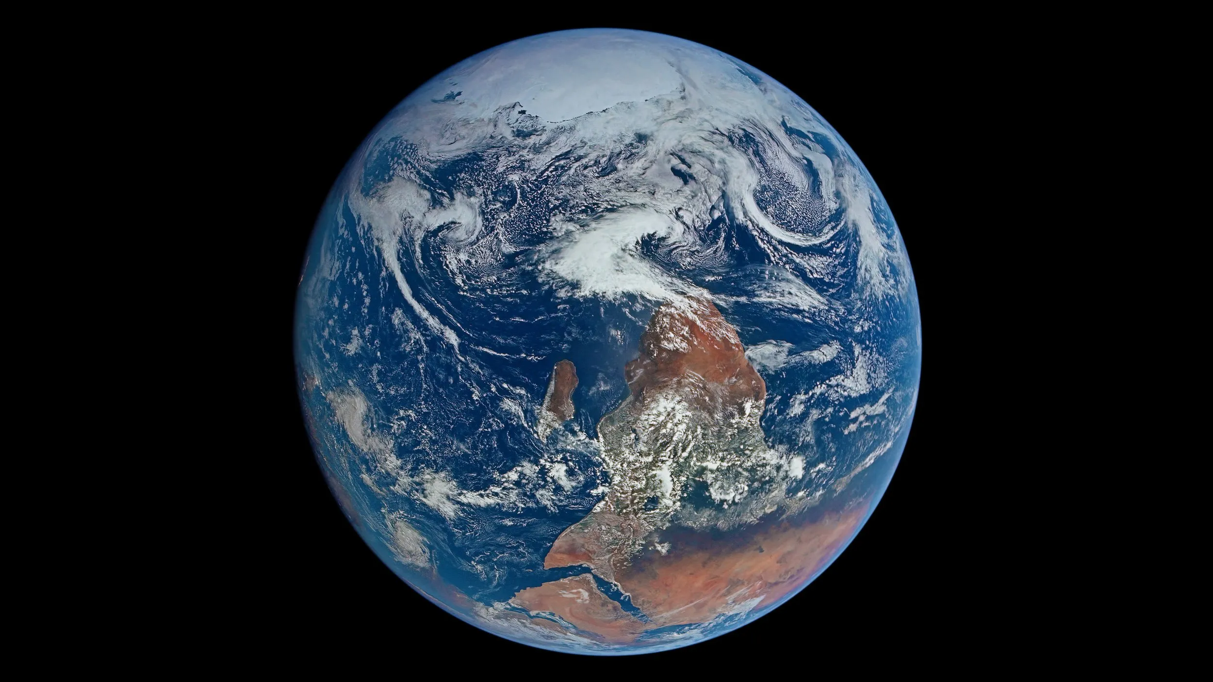
The Blue Marble — NASA’s iconic Apollo 17 photograph (AS17-148-22727), the inspiration for GLOBAÏA’s logo. Taken by the Apollo 17 crew on December 7, 1972, the original photograph showed Antarctica at the top and Africa below — because in space there is no up or down, and the crew simply happened to be oriented with the south pole overhead. NASA flipped the image before releasing it, because “south up” felt disorienting to a Northern Hemisphere-dominated audience — a quiet irony, given that the most iconic photograph of Earth as a borderless whole was immediately reframed to match our parochial cartographic convention
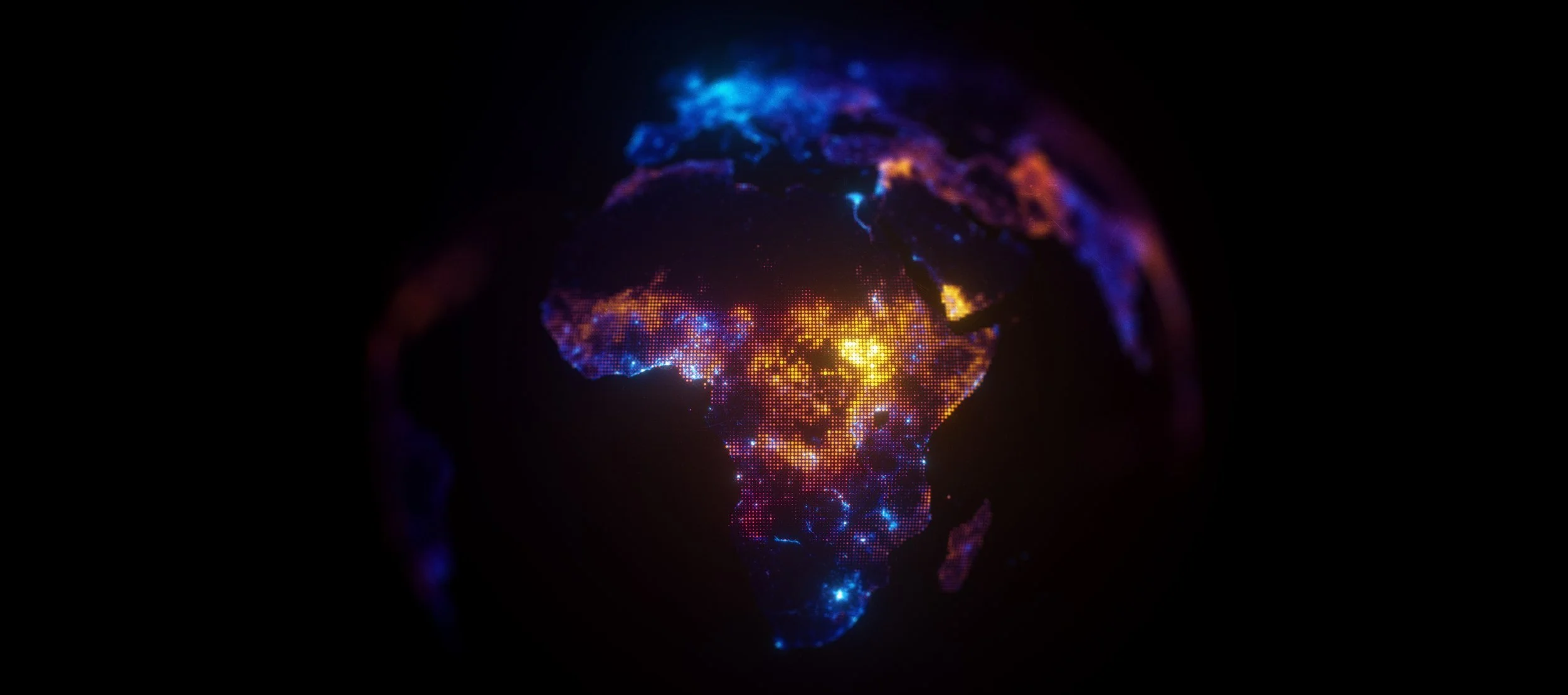
It is further enhanced by the inclusion of two lines, representing the Equator and the Polar Circle. These lines serve as a visual reminder that the Sun’s energy is not uniformly distributed across Earth’s surface, resulting in significant variations in climate and biosphere. This uneven distribution of solar energy is a key driver of Earth’s diverse ecosystems, weather patterns, and climate zones.
Our Motto
Cultivating planetary awareness through science and art
It emphasizes the unique power of visuals to transcend cultural and linguistic barriers, moving hearts and minds in ways that words alone cannot. The aesthetic component of our work complements the knowledge and data-driven foundation of science, creating a more holistic approach to understanding our planet. Through art, we evoke emotion and connection, turning complex environmental issues into compelling narratives that inspire action and foster a deeper, shared sense of responsibility for Earth.